Choosing the right font and style for engraved jewelry is a significant step in creating a piece that not only looks beautiful but also holds personal meaning. Engraved jewelry often serves as a keepsake or a gift, making the selection of font and style crucial in conveying the right sentiment. This guide aims to provide you with essential tips and insights to help you navigate this important decision.
When it comes to engraved jewelry, certain fonts stand out due to their popularity and aesthetic appeal. Some of the most commonly used fonts include:
- Times New Roman – A classic serif font that evokes tradition.
- Arial – A clean and modern sans serif option.
- Brush Script – A cursive font that adds a personal touch.
- Georgia – A serif font that combines readability with elegance.
Exploring these fonts can help you make an informed decision that reflects your personal style and the sentiment behind the piece.
The font you choose can dramatically influence the overall aesthetic of your jewelry. For instance, a bold font can create a striking look, while a delicate script can evoke feelings of romance and intimacy. It’s essential to consider the occasion and the message you wish to convey when selecting a font.
Understanding the differences between serif and sans serif fonts can help you determine which style aligns best with your design vision:
- Serif Fonts: These feature small lines or embellishments at the ends of characters, offering a classic and elegant feel. They are often used for formal occasions.
- Sans Serif Fonts: These lack decorative strokes, providing a modern and clean look that is ideal for contemporary designs.
Script fonts are a popular choice for engraved jewelry, particularly for sentimental pieces such as wedding bands or gifts. They can add a romantic and personal touch, making the engraving feel unique and special.
Different styles of jewelry can influence font selection:
- Classic Styles: Traditional fonts work best to enhance the timeless appeal of classic jewelry.
- Modern Styles: Bold and unique fonts can make a statement, reflecting contemporary trends while maintaining readability.
Readability is paramount in engraved jewelry. Here are some tips to ensure your message is clear:
- Font Size: Selecting an appropriate font size is essential for ensuring that engraved text is easily readable without overwhelming the design.
- Spacing and Alignment: Proper spacing and alignment can greatly enhance the readability of engraved text, ensuring that your message is both aesthetically pleasing and easy to read.
Understanding the limitations of engraving technology and materials can help you choose a font and style that will work effectively:
- Material Restrictions: Different materials may have specific engraving limitations, impacting font choice.
- Size Limitations: Engraving size limitations can affect how much text can be included, guiding your font and style decisions effectively.
In conclusion, selecting the right font and style for engraved jewelry is a blend of personal preference, style, and practical considerations. By understanding the various options available and their implications, you can create a piece that is not only beautiful but also deeply meaningful.
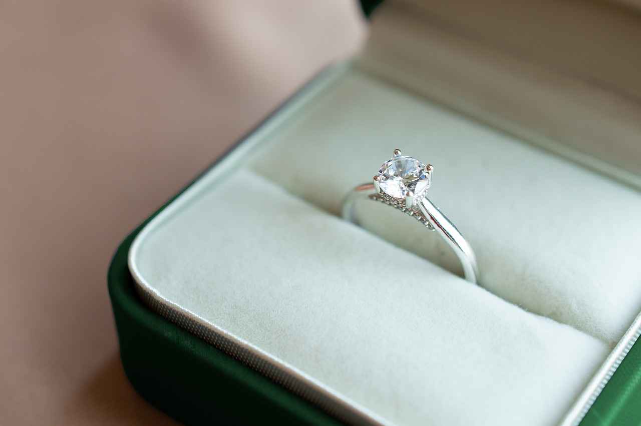
What Are the Popular Fonts for Engraved Jewelry?
When it comes to engraving jewelry, the font selection plays a pivotal role in conveying the intended message and enhancing the overall aesthetic of the piece. The right font not only reflects personal style but also captures the sentiment behind the jewelry. In this section, we will explore some of the most popular fonts used for engraved jewelry, helping you make an informed choice that aligns with your vision.
Engraved jewelry often features a variety of font styles, each offering a unique character and feel. Here are some of the most commonly used fonts:
- Serif Fonts: These fonts, characterized by small lines or embellishments at the ends of letters, convey a sense of tradition and elegance. Popular serif fonts for engraving include Times New Roman and Georgia. They are often chosen for formal occasions, such as weddings or anniversaries, where a classic touch is desired.
- Sans Serif Fonts: Sans serif fonts, which lack the decorative strokes of serif fonts, provide a modern and clean appearance. Options like Arial and Helvetica are frequently used in contemporary jewelry designs, appealing to those who prefer a minimalist style.
- Script Fonts: These fonts mimic cursive handwriting and add a personal touch to engraved pieces. Fonts such as Brush Script or Edwardian Script are popular choices for sentimental items like wedding bands or personalized gifts, evoking a sense of romance and intimacy.
- Display Fonts: For those looking to make a bold statement, display fonts offer unique and artistic designs. Fonts like Impact or Rockwell stand out and can be used to emphasize important dates or names, making them suitable for more casual or playful pieces.
Choosing the right font is not just about aesthetics; it also reflects your personality and the message you wish to convey. Consider the occasion and the recipient when selecting a font, as it can greatly influence the emotional impact of the piece.
The font you choose can significantly affect the overall design of your jewelry piece. A well-selected font can enhance the beauty of the jewelry while ensuring that the engraved message is clear and legible. For example:
- Elegant Designs: If your jewelry features intricate designs, opting for a simple serif or sans serif font can help maintain balance and clarity.
- Bold Statements: For more modern or artistic pieces, a script or display font can add a unique flair, making the engraving a focal point of the design.
Ultimately, the font should complement the jewelry’s style and the sentiment behind the engraving, ensuring that it resonates with the wearer.
When choosing fonts for engraved jewelry, it’s essential to consider potential limitations that may affect your decision:
- Material Restrictions: Different materials may have specific engraving limitations. For instance, softer metals may not hold intricate details as well as harder materials, impacting font choice.
- Size Limitations: Engraving size limitations can affect how much text can be included. Being aware of these constraints can guide your font and style decisions effectively.
In summary, selecting the right font for engraved jewelry is a crucial step in the design process. By understanding the popular font styles and their implications, you can create a piece that is not only visually appealing but also meaningful.
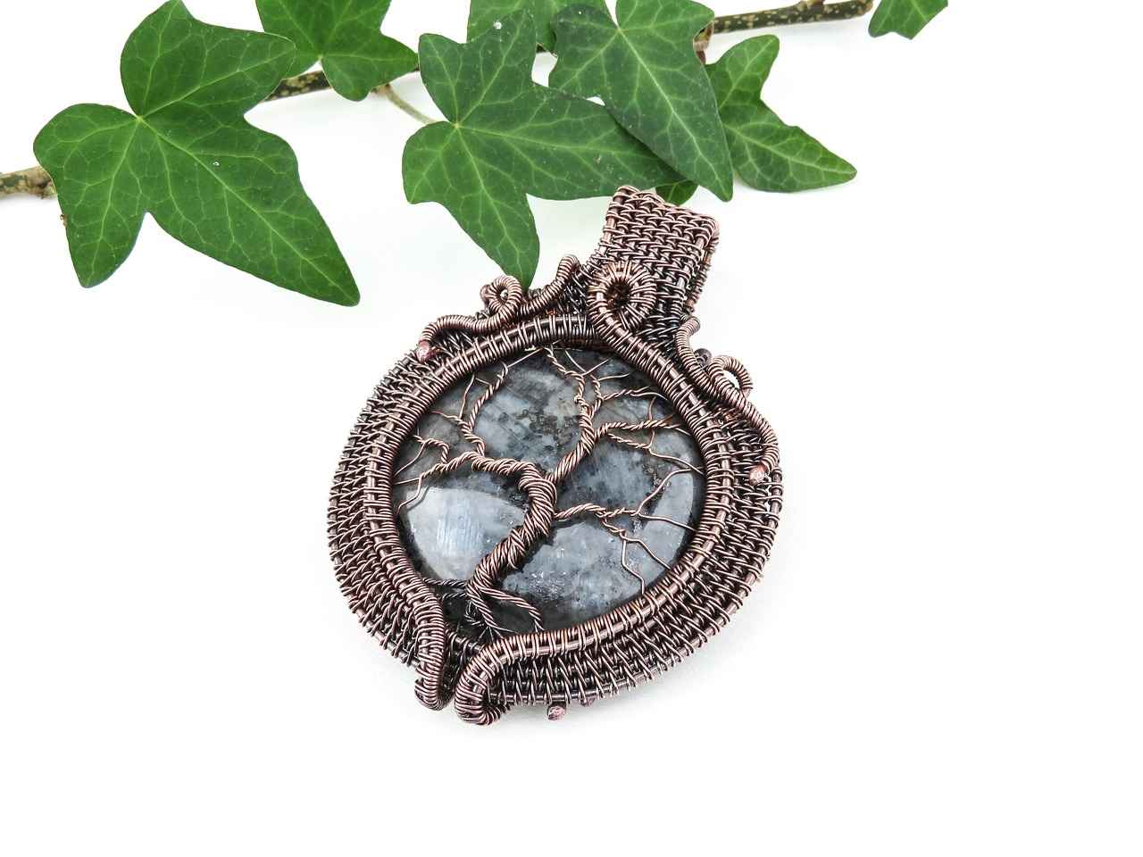
How Does Font Choice Impact the Overall Design?
When designing engraved jewelry, font choice plays a pivotal role in shaping the overall aesthetic of the piece. The right font can significantly enhance the emotional connection to the jewelry, making it not just an accessory but a cherished memory. Understanding how different fonts can affect the overall look and feel of your jewelry is crucial for achieving a design that resonates with the occasion.
The font you choose for engraving can convey a specific mood or message. For example, a flowing script font may evoke romance and intimacy, making it perfect for wedding bands or anniversary gifts. In contrast, a bold sans serif font can impart a modern and confident vibe, ideal for statement pieces. This careful selection ensures that the jewelry not only looks beautiful but also carries the intended sentiment.
Each font has its own personality and can influence how the jewelry is perceived. For instance, serif fonts, characterized by their decorative strokes, often suggest elegance and tradition. This makes them suitable for formal occasions and classic designs. On the other hand, sans serif fonts offer a clean and contemporary look, which can make a piece feel more casual and approachable.
Indeed, the style of the jewelry piece often dictates the font choice. Classic styles like vintage rings or heirloom pieces typically pair well with traditional fonts that enhance their timeless appeal. Conversely, modern styles, such as minimalist necklaces or geometric designs, can benefit from bold and unique fonts that make a statement while remaining readable.
Readability is paramount in engraved text. A beautifully designed piece can lose its impact if the message is unclear. Therefore, selecting the right font size, spacing, and style is essential to ensure that your engraving is both aesthetically pleasing and legible. For instance, smaller font sizes may look elegant but can become difficult to read, especially on intricate designs.
- Font Size: Choose a size that balances visibility and design. A size that is too small may be hard to read, while one that is too large can overwhelm the jewelry’s design.
- Spacing: Proper spacing between letters and lines can greatly enhance readability. Too tight spacing can crowd the text, making it difficult to decipher.
- Alignment: Ensure that the text is aligned correctly within the jewelry’s design. Misalignment can detract from the overall aesthetic.
When selecting a font for engraved jewelry, it’s essential to understand the limitations of the engraving process and the material being used. Different materials may have specific restrictions that can affect font choice. For example, softer metals may allow for finer details, while harder materials may require bolder fonts to ensure clarity.
Different materials can present unique challenges for engraving. For instance, wood may allow for intricate designs but can be limited in the depth of engraving. Metal, on the other hand, can accommodate a broader range of fonts but may necessitate consideration of the font’s thickness to ensure durability. Understanding these nuances can help you select a font that not only looks good but also stands the test of time.
In summary, the font you choose for engraved jewelry is a critical element that influences the overall design and emotional resonance of the piece. By considering the style, readability, and material limitations, you can create a beautiful and meaningful piece that truly reflects the occasion.
Serif vs. Sans Serif: Which Is Better?
When it comes to selecting the perfect font for engraved jewelry, understanding the differences between serif and sans serif fonts is essential. Each font style carries its own unique characteristics and implications, influencing both the aesthetic and emotional impact of your piece. This article delves into the nuances of these two font categories, helping you make an informed choice that aligns with your design vision.
Serif fonts are characterized by their small decorative lines or strokes at the ends of characters, known as serifs. These fonts often evoke a sense of tradition and formality, making them a popular choice for classic and elegant jewelry designs. Common examples include Times New Roman and Georgia. The intricate details of serif fonts can add a touch of sophistication, making them ideal for formal occasions such as weddings or anniversaries.
In contrast, sans serif fonts are devoid of these embellishments, offering a clean and modern appearance. Examples include Arial and Helvetica. The simplicity of sans serif fonts makes them particularly suitable for contemporary designs and casual settings. They convey a sense of clarity and straightforwardness, which can resonate well with a more minimalist approach to jewelry.
Choosing between serif and sans serif fonts is not merely a matter of aesthetics; it also involves considering the message you wish to convey. Serif fonts can evoke feelings of elegance and tradition, while sans serif fonts often communicate modernity and simplicity. For example, if you’re designing a piece to celebrate a milestone event, a serif font might enhance the sense of occasion. Conversely, for a casual gift, a sans serif font could reflect a more relaxed sentiment.
Regardless of the font style you choose, readability is paramount in engraved text. Serif fonts might be more challenging to read at smaller sizes due to their intricate details. On the other hand, sans serif fonts typically maintain clarity, making them easier to read in various sizes. When selecting a font, consider the size of the engraving area and ensure that the text remains legible.
Sometimes, the best approach is to combine both serif and sans serif fonts. Using a serif font for the main text and a sans serif font for accents or dates can create a visually appealing contrast. This pairing can enhance the overall design while ensuring that the message remains clear and engaging.
The style of your jewelry piece should also guide your font choice. For instance, classic styles often benefit from the elegance of serif fonts, while modern designs can shine with the clean lines of sans serif fonts. Understanding the interplay between font and jewelry style can elevate your design and ensure that the engraving complements the overall look.
Ultimately, the decision between serif and sans serif fonts depends on your personal style, the sentiment behind the piece, and the desired impact on the viewer. By considering these factors and understanding the characteristics of each font type, you can select a font that not only enhances your jewelry but also resonates with the message you wish to convey.
Characteristics of Serif Fonts
When it comes to the world of typography, serif fonts stand out as a classic choice, often associated with tradition and elegance. These fonts are characterized by small lines or decorative strokes at the ends of their letters, known as serifs. This distinctive feature not only enhances the visual appeal of the text but also contributes to a sense of formality and sophistication, making serif fonts particularly suitable for a variety of applications, including engraved jewelry.
Serif fonts are designed with small embellishments that add character to each letter. These features can evoke feelings of trust and reliability, often making them a popular choice for formal documents, invitations, and, of course, engraved jewelry. The presence of serifs can create a more cohesive flow when reading, which is why many people find them easier to read in printed materials.
Choosing a serif font for engraved jewelry can be particularly impactful during formal occasions such as weddings, anniversaries, or graduations. The elegance of serif fonts complements the sentimentality of these events, allowing the engraving to resonate more deeply with the recipient. For instance, a classic serif font can beautifully enhance the engraving on a wedding band, adding a touch of timelessness to the piece.
- Times New Roman: A quintessential serif font known for its readability and classic appeal.
- Garamond: An elegant font with a rich history, perfect for adding a sophisticated touch.
- Baskerville: A font that combines beauty with readability, often used in formal settings.
- Georgia: A modern serif font that retains traditional qualities, making it versatile for various designs.
One of the main advantages of serif fonts is their readability. The small lines at the ends of the letters can guide the eye along the text, making it easier to read, especially in longer engravings. Additionally, serif fonts tend to convey a sense of authority and prestige, which can enhance the perceived value of the jewelry piece.
While serif fonts offer numerous benefits, there are some considerations to keep in mind:
- Space Constraints: Engraving space can be limited, so it’s essential to choose a font that remains legible at smaller sizes.
- Material Compatibility: Different materials may affect how well the details of a serif font are captured during the engraving process.
- Personal Style: Ensure that the chosen serif font aligns with the personal style of the recipient and the overall design of the jewelry.
In summary, serif fonts bring a classic and elegant touch to engraved jewelry, making them an excellent choice for formal occasions. By understanding the unique characteristics and advantages of these fonts, you can make a more informed decision that enhances the beauty and meaning of your engraved piece. Whether you opt for a traditional font like Times New Roman or a more modern option like Georgia, the right serif font can elevate your jewelry and create a lasting impression.
Characteristics of Sans Serif Fonts
When it comes to selecting fonts for engraved jewelry, sans serif fonts have gained significant popularity due to their unique characteristics. Unlike serif fonts, which feature small decorative strokes at the ends of letters, sans serif fonts present a more modern and clean appearance. This simplicity makes them particularly appealing for contemporary jewelry designs and casual settings.
One of the main advantages of sans serif fonts is their readability. The absence of embellishments allows for clear and easy recognition of each character, which is crucial when engraving messages that hold sentimental value. Whether it’s a name, date, or a special phrase, the clarity of sans serif fonts ensures that every word stands out, making the engraving not only beautiful but also legible.
Moreover, sans serif fonts convey a sense of minimalism that resonates with modern aesthetics. This makes them an ideal choice for contemporary jewelry, where the design often emphasizes simplicity and elegance. The straightforward lines of sans serif fonts can complement the sleek designs of modern pieces, enhancing their overall appeal.
In addition to their visual appeal, sans serif fonts are versatile. They can be used across various types of jewelry, from bracelets to necklaces, adapting seamlessly to different styles and materials. This adaptability allows jewelers to create pieces that reflect personal style while maintaining a cohesive look.
Another significant aspect of sans serif fonts is their ability to convey a sense of approachability and friendliness. This characteristic makes them suitable for casual jewelry, such as friendship bracelets or personalized gifts. The clean lines and straightforward design can evoke feelings of warmth and connection, making the piece even more meaningful.
When considering sans serif fonts for engraving, it’s essential to choose a font that aligns with the overall design and purpose of the jewelry. For instance, a bold sans serif font may be appropriate for a statement piece, while a lighter, more delicate sans serif might suit a more understated design. This thoughtful selection ensures that the font enhances the piece rather than detracts from it.
In conclusion, sans serif fonts offer a modern, clean, and versatile option for engraved jewelry. Their readability, minimalism, and friendly appearance make them an excellent choice for various styles and occasions. By understanding the unique characteristics of sans serif fonts, you can make informed decisions that elevate your jewelry pieces, ensuring they are both personal and aesthetically pleasing.
Choosing Script Fonts for a Personal Touch
When it comes to engraved jewelry, the choice of font plays a pivotal role in conveying emotion and sentiment. Among the various font styles available, script fonts stand out as a popular option, particularly for pieces meant to commemorate special occasions. These fonts can add a romantic and personal touch to items such as wedding bands, anniversary gifts, or memorial jewelry, making them a favored choice for those looking to express heartfelt messages.
Script fonts mimic the fluidity of handwriting, which inherently makes them feel more intimate. The swirls and curves of these fonts evoke a sense of elegance and affection, making them ideal for sentimental pieces. Whether you are engraving a name, date, or a meaningful quote, script fonts can transform a simple message into a cherished keepsake.
- Fluidity: Script fonts are characterized by their flowing lines and connected letters, resembling cursive writing.
- Elegance: These fonts often convey a sense of sophistication, making them suitable for formal occasions.
- Personalization: The unique style of script fonts allows for a more individualized touch, enhancing the sentimental value of the piece.
Selecting the right script font involves considering both the design of the jewelry and the message you wish to convey. Here are some tips to guide your decision:
- Readability: Ensure that the chosen font is legible, especially if the engraving is small. Some script fonts can be overly ornate, making them difficult to read.
- Style Compatibility: Match the font style with the overall design of the jewelry. A delicate script font may complement a dainty necklace, while a bolder script might be better suited for a statement ring.
- Length of Text: Consider the amount of text you want to engrave. Longer phrases may require a simpler script font to maintain clarity.
While script fonts can enhance the beauty of engraved jewelry, there are limitations to consider:
- Material Limitations: Certain materials may not hold intricate script details well. For example, softer metals might distort fine lines, while harder materials might require a different engraving technique.
- Size Constraints: The size of the engraving area can limit the complexity of the script font. Be mindful of how the font will appear on the jewelry piece.
Several script fonts are popular among jewelers for their aesthetic appeal and legibility. Some of these include:
- Great Vibes: A cursive font that is both elegant and easy to read.
- Allura: A flowing script that adds a touch of sophistication.
- Brush Script: A casual yet stylish font that feels personal and warm.
In conclusion, choosing a script font for engraved jewelry can significantly enhance the emotional value of the piece. By considering the characteristics of script fonts, their compatibility with the jewelry design, and any limitations, you can select a font that not only looks beautiful but also resonates with the sentiment behind the engraving. Whether you are celebrating love, friendship, or remembrance, a well-chosen script font can help convey your message in a truly personal way.
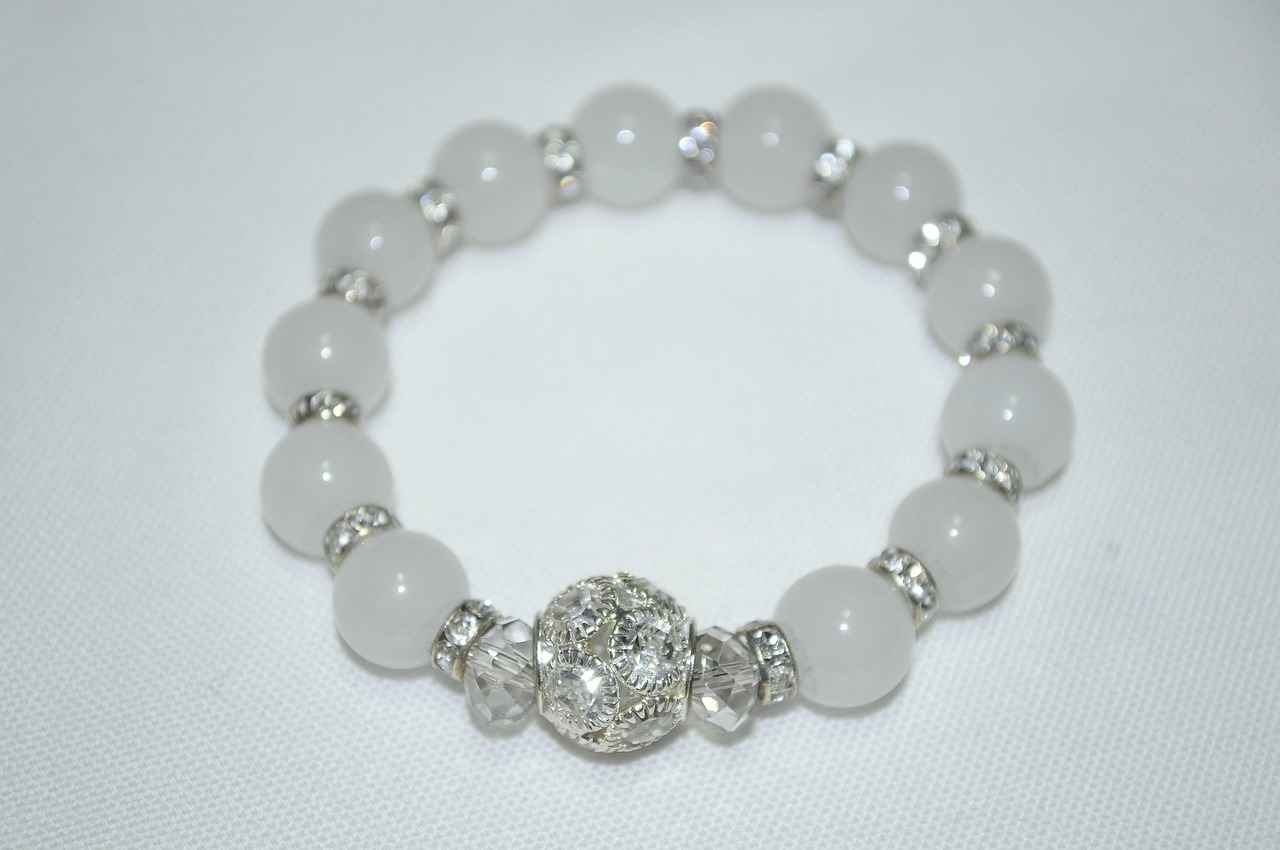
What Styles Complement Different Types of Jewelry?
When it comes to selecting the perfect font for engraved jewelry, the style of the jewelry piece plays a crucial role. Each type of jewelry has its own unique characteristics, and understanding how these characteristics interact with font choice can significantly enhance the overall design. In this section, we will explore how different jewelry styles influence font selection and provide insights into achieving a harmonious balance.
The relationship between jewelry style and font selection is essential for creating a cohesive piece. For instance, classic styles often evoke a sense of tradition and elegance. Therefore, fonts that are timeless and refined work best. On the other hand, modern jewelry designs may call for more bold and contemporary fonts that reflect current trends and personal flair.
Classic jewelry styles, such as vintage rings or pearl necklaces, often benefit from fonts that enhance their timeless appeal. Fonts like Garamond or Times New Roman are excellent choices, as they convey a sense of sophistication. These serif fonts, with their elegant lines, complement the intricate details of classic designs, ensuring that the engraving looks both beautiful and appropriate.
For modern jewelry, designs often lean towards minimalism and clean lines. In this case, sans serif fonts like Helvetica or Futura can be particularly effective. Their simplicity and clarity allow for a striking contrast against the jewelry, making the engraving a focal point. Furthermore, unique and artistic fonts can add a personal touch, making the piece stand out in a crowd.
Jewelry pieces that embrace an artistic style, such as handmade or bohemian designs, often allow for more creative font choices. Script fonts, which mimic handwriting, can add a romantic and personal touch. Options like Brush Script or Pacifico can enhance the uniqueness of the piece, making it feel special and individualized.
Themed jewelry, such as holiday-themed pieces or sports memorabilia, can also dictate font selection. For instance, playful fonts with a whimsical flair can enhance the fun aspect of a holiday charm bracelet, while more robust and rugged fonts may suit masculine designs like dog tags or cufflinks. Understanding the theme can guide you in selecting a font that complements the overall message and style.
To achieve harmony between the font and jewelry style, consider the following tips:
- Match the Tone: Ensure that the font’s personality aligns with the jewelry’s style. For example, a delicate font for a dainty necklace.
- Maintain Legibility: Regardless of style, the chosen font must remain legible, especially in smaller sizes.
- Consider Material: The type of material can affect how certain fonts appear when engraved. Opt for fonts that will translate well onto the specific material.
In summary, the interplay between jewelry style and font choice is a vital aspect of creating a successful engraved piece. By understanding the unique characteristics of different jewelry styles and selecting fonts that complement them, you can enhance the overall design and ensure that your message is conveyed beautifully.
Classic Styles: What Fonts Work Best?
When it comes to engraved jewelry, the choice of font is just as significant as the design itself. Classic styles often evoke a sense of timeless elegance, and the right font can enhance this allure. In this section, we will explore the best font choices for classic jewelry styles, ensuring that your engravings not only look beautiful but also resonate with the sentiment behind the piece.
The font you choose for engraving can greatly influence the overall aesthetic of your jewelry. Classic styles, such as vintage rings or heirloom necklaces, typically call for fonts that reflect their traditional roots. These fonts should complement the piece’s design while also ensuring the engraved message is clear and legible.
- Times New Roman: A classic serif font that exudes sophistication and formality, making it ideal for wedding bands and formal occasions.
- Garamond: Known for its elegance and readability, Garamond is perfect for pieces that require a touch of class.
- Baskerville: This font features a refined style that works well for both names and dates, adding a personal touch to any classic piece.
- Trajan: Often used in formal inscriptions, Trajan has a regal quality that enhances the timeless appeal of classic jewelry.
When selecting a font for your engraved jewelry, consider the following:
- Occasion: Is the piece meant for a wedding, anniversary, or a special gift? The occasion can guide your font choice.
- Material: Different materials may require different font styles for optimal engraving results. For example, softer metals may not hold fine details as well as harder materials.
- Size of the Jewelry: Smaller pieces may need simpler fonts to ensure readability, while larger pieces can accommodate more intricate designs.
While it’s important to choose a font that fits the classic style, readability must not be compromised. Here are some tips:
- Font Size: Ensure the font size is appropriate for the piece. Too small can be difficult to read, while too large can overwhelm the design.
- Spacing: Adequate spacing between letters and lines ensures that the engraving is legible and aesthetically pleasing.
- Alignment: Proper alignment of text can enhance the overall look of the engraving, making it easier to read and more visually appealing.
Choosing the right font for engraved jewelry, especially in classic styles, is crucial for achieving a look that is both elegant and personal. By considering the occasion, material, and size of the jewelry, you can select a font that complements the piece beautifully while ensuring that your message is clear and impactful. Remember, the right font not only enhances the aesthetic appeal of your jewelry but also adds a layer of sentiment that will be cherished for years to come.
Modern Styles: Which Fonts Stand Out?
When it comes to modern jewelry designs, the choice of font plays a pivotal role in defining the overall aesthetic and appeal of the piece. As styles evolve, the demand for bold and unique fonts has surged, allowing designers to create pieces that truly stand out. In this section, we will explore how the right font can enhance modern jewelry, making a striking statement while ensuring readability.
Choosing a bold font for modern jewelry is not just about making a statement; it reflects contemporary trends and personal style. Bold fonts can convey confidence and individuality, making them perfect for pieces intended to be eye-catching. They often feature clean lines and unique characteristics that draw attention without overwhelming the design.
- Geometric Fonts: These fonts utilize shapes and angles, providing a modern and artistic flair.
- Handwritten Fonts: Offering a personal touch, these fonts can make the piece feel unique and intimate.
- Display Fonts: Often characterized by their decorative elements, display fonts can turn a simple engraving into a work of art.
While bold and unique fonts are essential for modern designs, it is crucial to maintain readability. Engraved jewelry often involves small text, so selecting a font that remains legible at various sizes is vital. Here are some tips to ensure that your chosen font is both stylish and readable:
- Font Size: Opt for a size that is large enough to be read easily, yet small enough to fit comfortably on the jewelry piece.
- Letter Spacing: Adequate spacing between letters can enhance clarity, preventing the text from appearing cramped.
- Contrast: Ensure that the font color contrasts well with the background material of the jewelry to enhance visibility.
Modern jewelry often features a mix of materials and design elements. When selecting a font, consider how it interacts with other aspects of the piece. For instance, a bold font may pair well with minimalist designs, while a more intricate font could complement detailed embellishments. The goal is to create a harmonious balance that enhances the overall aesthetic.
Staying updated with current trends can help you choose fonts that resonate with contemporary tastes. Some popular trends include:
- Minimalism: Simple, clean fonts are gaining traction, emphasizing elegance and sophistication.
- Vintage Styles: Retro fonts are making a comeback, offering a nostalgic touch to modern pieces.
- Custom Fonts: Many designers are opting for bespoke fonts that reflect their brand identity, allowing for a unique touch.
In conclusion, the right font choice in modern jewelry design is essential for creating pieces that are not only visually appealing but also carry a personal touch. By considering factors such as readability, design harmony, and current trends, you can select a font that truly stands out while enhancing the overall aesthetic of your jewelry.
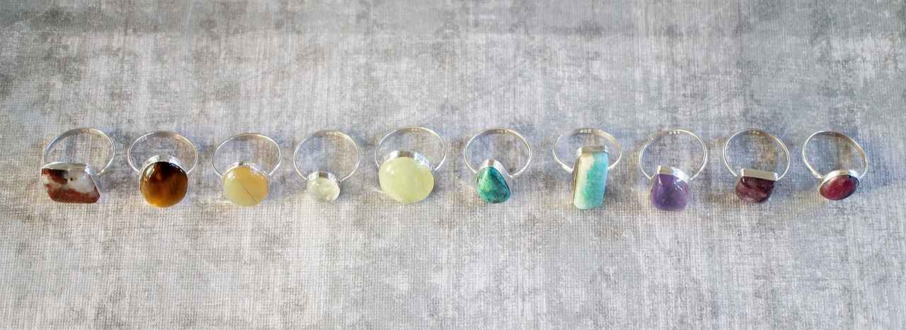
How to Ensure Readability in Engraved Text?
When it comes to engraved jewelry, ensuring that your message is easily readable is of utmost importance. The right font choice, size, and spacing can significantly impact how well your engraving communicates your intended sentiment. This article explores how to enhance the readability of engraved text, providing you with practical tips and insights.
Readability is crucial because engraved jewelry often carries sentimental messages or important information. Whether it’s a name, date, or a meaningful phrase, clarity ensures that the message resonates with the wearer and those who see it. A well-chosen font and design can transform a simple piece of jewelry into a cherished keepsake.
Choosing the right font size is essential for readability. A size that is too small may become illegible, especially when engraved on small surfaces. Conversely, a font that is too large can overwhelm the design. As a general rule, aim for a font size that balances visibility and aesthetics. For most jewelry pieces, a size between 1.5 mm and 3 mm is often ideal.
Proper spacing between letters and words can greatly enhance readability. Tight spacing can make letters appear cramped and difficult to read, while excessive spacing can disrupt the flow of the text. Aim for a comfortable amount of space that allows each character to breathe. A spacing of 0.5 mm to 1 mm is typically recommended, but this can vary based on the font style.
Different font styles can significantly impact readability. Here are some popular options:
- Serif Fonts: These fonts have small lines at the ends of letters, which can enhance readability in larger sizes.
- Sans Serif Fonts: Known for their clean lines, sans serif fonts often work well for modern designs and smaller engravings.
- Script Fonts: While they can add a personal touch, script fonts should be used cautiously, as they can sometimes hinder readability.
Proper alignment is crucial for ensuring that engraved text is easy to read. Centered text is often visually appealing, but left-aligned text can enhance readability, especially for longer messages. Consider the overall design of the jewelry piece when deciding on alignment to ensure that the text complements the piece rather than detracting from it.
When selecting a font for engraving, it’s important to consider the material of the jewelry. Different materials have varying engraving capabilities, which can affect how well certain fonts translate. For instance, softer metals may allow for more intricate designs, while harder materials might require simpler fonts to ensure clarity.
Size limitations can also play a significant role in your font choice. Depending on the size of the jewelry piece, there may be restrictions on how much text can be included. Always measure the available space before finalizing your engraving to avoid disappointment.
In conclusion, ensuring readability in engraved jewelry is a multifaceted process that involves careful consideration of font size, spacing, style, alignment, and material. By following these guidelines, you can create a meaningful piece that is not only beautiful but also conveys your message clearly.
Font Size Considerations
When it comes to engraved jewelry, one of the most critical aspects to consider is the font size. Selecting an appropriate font size is essential for ensuring that engraved text is easily readable without overwhelming the design of the jewelry. The right font size not only enhances the aesthetic appeal of the piece but also ensures that the message is conveyed clearly. Here are some key considerations to keep in mind when choosing the font size for your engraved jewelry.
The font size you choose can significantly impact the overall look of your jewelry. A font that is too small may render the text illegible, while a size that is too large can overpower the design, detracting from the jewelry’s elegance. Striking the right balance is crucial for both aesthetics and functionality.
- Consider the Jewelry Type: Different types of jewelry require different font sizes. For instance, a delicate pendant may benefit from a smaller font, while a bold cuff bracelet can accommodate larger text.
- Engraving Area: The size of the engraving area is a determining factor. A larger area allows for a bigger font, while smaller spaces necessitate a more compact typeface.
- Readability: Always prioritize readability. Test various font sizes on a sample piece to see how they look and feel.
Typically, font sizes for engraving range from 1mm to 4mm. Here’s a breakdown:
| Font Size (mm) | Best For |
|---|---|
| 1mm | Small pendants and delicate pieces |
| 2mm | Rings and bracelets |
| 3mm | Larger pieces and statement jewelry |
| 4mm | Bold designs and large engraving areas |
Font size plays a significant role in the overall design harmony of the piece. A well-chosen font size complements the jewelry’s style, enhancing its visual appeal. For example, using a larger font in a traditional design may clash with the piece’s elegance, while a smaller font in a modern piece may appear insignificant. Thus, understanding the relationship between font size and design is essential for creating a cohesive look.
While it’s essential to choose an appropriate font size, there are limitations to consider:
- Material Constraints: Some materials may not hold fine details well, making smaller fonts less effective.
- Engraving Technique: Different engraving techniques have their own limitations regarding how small or intricate the text can be.
In conclusion, selecting the right font size for engraved jewelry is a delicate balance of readability, design integrity, and material considerations. By taking the time to evaluate these factors, you can ensure that your engraved message is not only beautiful but also legible and meaningful.
Spacing and Alignment Tips
When it comes to engraved jewelry, the visual appeal and clarity of the text are paramount. One of the most critical aspects influencing the readability of engraved text is spacing and alignment. Properly executed, these elements can significantly enhance the overall aesthetic and ensure that your message is conveyed effectively.
Spacing refers to the distance between letters, words, and lines of text. Adequate spacing is essential for several reasons:
- Readability: Well-spaced text is easier to read, especially when viewed from different angles or distances.
- Aesthetics: Proper spacing creates a balanced look, making the engraving more visually appealing.
- Clarity: Sufficient space helps prevent letters from merging, which can lead to confusion in reading the intended message.
Alignment involves positioning the text in relation to the jewelry piece. The alignment can be left, center, or right, and it plays a crucial role in the overall look:
- Center Alignment: This is often the most popular choice for engraved jewelry as it creates a symmetrical and harmonious appearance.
- Left Alignment: This can provide a more modern and sleek look, especially for contemporary designs.
- Right Alignment: Less commonly used, but can add an artistic flair to unique pieces.
When selecting the spacing and alignment for your engraved text, consider the following tips:
- Font Size: Larger fonts may require more spacing to maintain readability, while smaller fonts can be closer together.
- Type of Font: Some fonts are naturally wider or narrower, affecting how much space is needed between characters.
- Jewelry Shape: The shape and size of the jewelry piece will dictate how much text can be included and how it should be aligned.
To illustrate the importance of spacing and alignment, here are a few practical examples:
1. **Bracelets:** For a bracelet, a centered alignment with even spacing between letters creates a balanced look that is easy to read.2. **Rings:** In rings, especially those with a small engraving area, consider using a slightly larger font with generous spacing to ensure clarity.3. **Necklaces:** For pendants, left or right alignment can be used creatively, but ensure that the spacing remains consistent for a polished appearance.
In summary, proper spacing and alignment are essential components in the engraving process. They not only enhance the readability of your message but also contribute to the overall beauty of the piece. By paying attention to these details, you can create a stunning engraved jewelry piece that is both meaningful and visually appealing.

Are There Any Limitations to Consider?
When it comes to engraved jewelry, understanding the limitations of the technology and the materials used is essential. This knowledge can significantly influence your choice of font and style, ensuring that your engraving not only looks beautiful but also stands the test of time.
Engraving technology has evolved over the years, yet it still comes with specific limitations that can affect the final outcome of your jewelry piece. Here are some critical factors to consider:
- Precision and Detail: The level of detail that can be achieved varies based on the technology used. Laser engraving offers high precision, while traditional methods may not capture intricate designs as effectively.
- Depth of Engraving: Different techniques allow for varying depths of engraving. Depending on the material, some methods may only allow for shallow engravings, which can affect visibility over time.
- Speed of Production: While modern engraving machines can produce results quickly, intricate designs may require longer processing times, which could affect delivery timelines.
The material you choose for your jewelry can greatly influence the engraving process. Here are some common materials and their limitations:
| Material | Engraving Limitations |
|---|---|
| Gold | Soft and easy to engrave, but too much detail can lead to wear over time. |
| Stainless Steel | Durable but requires more powerful equipment for deep engraving. |
| Wood | Can be engraved easily, but moisture can affect the longevity of the engraving. |
Another crucial aspect of engraving is the size of the text and design. Here are some points to keep in mind:
- Font Size: Smaller fonts may become illegible when engraved, especially on curved surfaces. It is vital to choose a size that balances aesthetics and readability.
- Character Count: The amount of text you wish to engrave can be limited by the size of the jewelry piece. Always check with your jeweler to understand how much text can fit.
- Spacing: Proper spacing is necessary for clarity. Too little space can cause letters to merge, while too much can make the engraving look sparse.
By being aware of the limitations associated with engraving technology and materials, you can make informed decisions that align with your vision. This understanding will help you select a font and style that not only looks aesthetically pleasing but also works effectively with the engraving process.
Ultimately, the goal is to create a piece that reflects your unique style while ensuring that the engraving remains clear and durable over time. Taking these factors into account will lead to a more satisfying and successful engraving experience.
Material Restrictions
When it comes to engraved jewelry, one of the most important aspects to consider is the material of the piece. Each material has its own unique properties that can significantly affect the engraving process. Understanding these is crucial for selecting the right font and style, ultimately ensuring that the final product meets your expectations.
Jewelry can be made from a variety of materials, each with distinct characteristics. Here are some of the most common materials:
- Gold: A popular choice for its beauty and durability, gold can handle fine details but may require specific font choices to ensure clarity.
- Silver: Similar to gold, silver offers a sleek look but may tarnish over time, necessitating a font that is both elegant and readable.
- Stainless Steel: Known for its strength and resistance to corrosion, stainless steel allows for deeper engravings, which can accommodate bolder fonts.
- Wood: A unique choice that requires careful font selection, as intricate designs may not translate well on softer surfaces.
- Glass: Glass engraving can create stunning effects, but the font must be simple to maintain visibility and prevent cracking.
Each material’s physical properties influence how well it can be engraved. For instance, softer materials like wood may not support very fine details without risk of splintering, while harder materials like metal can accommodate more intricate designs.
Selecting the right font is essential for ensuring that your engraving is both beautiful and legible. Here are some considerations:
- Gold and Silver: These metals can handle both serif and sans serif fonts effectively, but choosing a simple font can enhance readability.
- Stainless Steel: Bold fonts work well here, as the material can support deeper engravings without losing detail.
- Wood: Opt for larger, bolder fonts with minimal detail to ensure the engraving remains clear.
- Glass: Simple, elegant fonts are best, as they help maintain clarity while adding a touch of sophistication.
Ignoring the specific limitations of the material can lead to disappointing results. For example, attempting to engrave a highly detailed font on a soft wood surface may result in a blurred or damaged engraving. Similarly, using a font that is too intricate on a glass piece could lead to cracking or breakage.
To ensure a successful engraving project, consider the following tips:
- Research Material Properties: Before choosing your font, familiarize yourself with the engraving capabilities of your selected material.
- Consult with Professionals: Engravers often have valuable insights regarding font and style choices based on their experience with different materials.
- Test Engravings: If possible, conduct a small test engraving to see how the font translates on your chosen material before committing to the final design.
By understanding and carefully selecting your font and style, you can create a piece of engraved jewelry that is not only visually appealing but also meaningful. This knowledge empowers you to make informed decisions, ensuring that your final product exceeds your expectations.
Size Limitations on Engraving
When considering engraved jewelry, one of the most critical factors is the . These limitations can significantly influence how much text can be included in your design. Understanding these constraints is essential for making informed decisions about the font and style that will best suit your piece.
Engraving size limitations exist due to the physical constraints of the jewelry piece itself. For instance, smaller items like rings or pendants have limited surface area, which restricts the amount of text that can be engraved. This is crucial for ensuring that the engraving remains legible and aesthetically pleasing.
When faced with size limitations, it’s important to choose a font that can convey your message effectively without compromising on readability. Bold fonts may work well in larger spaces, but in smaller areas, you might need to opt for more delicate, thin fonts that can fit more characters without overwhelming the design.
- Character Count: The number of letters and symbols that can fit in a designated space is often limited. For example, a standard ring may only accommodate 20-30 characters.
- Font Size: Larger fonts can be more difficult to fit in tight spaces. A smaller font size may be necessary to ensure all text fits within the engraving area.
- Spacing: Adequate spacing between letters is essential for readability. However, tight spacing may be required in smaller pieces, which can affect the overall aesthetic.
To make the most of your engraving space, consider the following tips:
- Abbreviate Wisely: Use initials or abbreviations where possible to save space while still conveying the intended message.
- Choose Simple Messages: Short, impactful phrases often resonate more than lengthy texts, especially in small engravings.
- Test Different Fonts: Experiment with various font styles and sizes to see which combination fits best within the constraints.
Different materials also play a role in engraving size limitations. Harder materials such as tungsten or titanium may require deeper engravings, which can limit the intricacy of the font. Conversely, softer materials like gold or silver allow for finer details but may still have size constraints due to the physical dimensions of the jewelry piece.
The technology used for engraving can also impose size limitations. Laser engraving, for instance, allows for more intricate designs than traditional methods, but it still has a minimum font size requirement to ensure clarity and precision. Understanding the capabilities and limitations of the engraving technology can help you make better design choices.
In summary, being aware of size limitations in engraving is crucial for creating a piece of jewelry that is both beautiful and meaningful. By considering the factors outlined above, you can choose the right font and style that aligns with the constraints of your jewelry, ensuring that your engraving is both legible and aesthetically pleasing.
Frequently Asked Questions
- What are the best fonts for engraved jewelry?
When it comes to engraved jewelry, popular font choices include elegant serif fonts for a classic look and modern sans serif fonts for a clean appearance. Script fonts can also add a personal touch, perfect for sentimental pieces!
- How does the choice of font affect my jewelry’s design?
The font you choose can dramatically influence your jewelry’s overall aesthetic. A bold font can make a statement, while a delicate script can convey intimacy. It’s all about matching the font to the piece’s style and the message you want to express!
- Are there any limitations I should consider when choosing a font?
Absolutely! Different materials can have specific engraving limitations, which may affect your font choice. Plus, keep in mind the size of your jewelry piece, as smaller areas may limit the amount of text and the font size you can use.
- How can I ensure the text on my jewelry is readable?
Readability is key! Choose a font size that’s not too small and ensure proper spacing between letters. Aligning the text correctly can also enhance clarity, making your engraved message easy to read and beautiful!
